B2C DESIGN / EMAILS
Transactional Emails redesign
COMPANY
Vivid Seats
ROLE
Ux Designer
YEAR
2020-2022
team
1 Design Director
1 Design Manager
1 UX Writer
1 Product Manager
2 UX Researchers
Context
Metrics
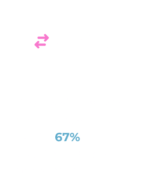
Reducing the total call volume of the support team
Improve clarity in order tracking by implementing a nudge that highlights the order status (tested with users)
Background
I was responsible for redefining the customer journey and understanding all the touchpoints across the site where customer communication is critical.

I also facilitated the discussions around the customer journey in regard to email and other modes of communication. At the same time, I highlighted the gaps and ensured I got alignment from various stakeholders and business teams to improve the overall email communication-related experiences.
Problem
Research & Planning
Ten participants from the U.S. and Canada were interviewed, all self-reported Vivid Seats users who had purchased an event ticket in the last six months. They represented a mix of ages, genders, and industries.
Design & Prototyping
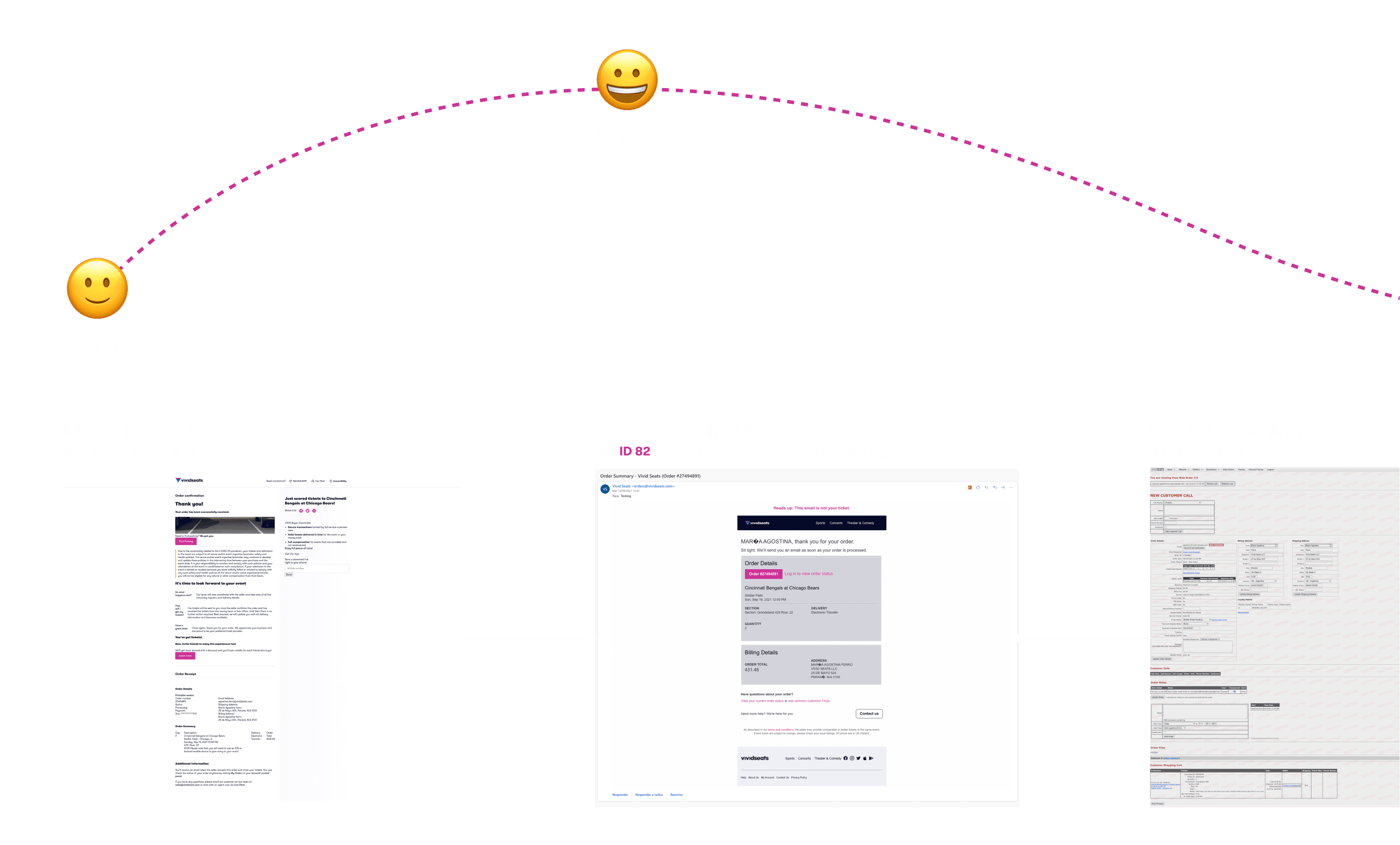
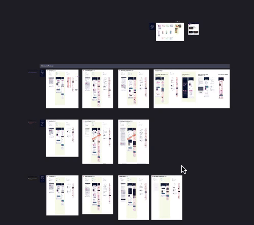
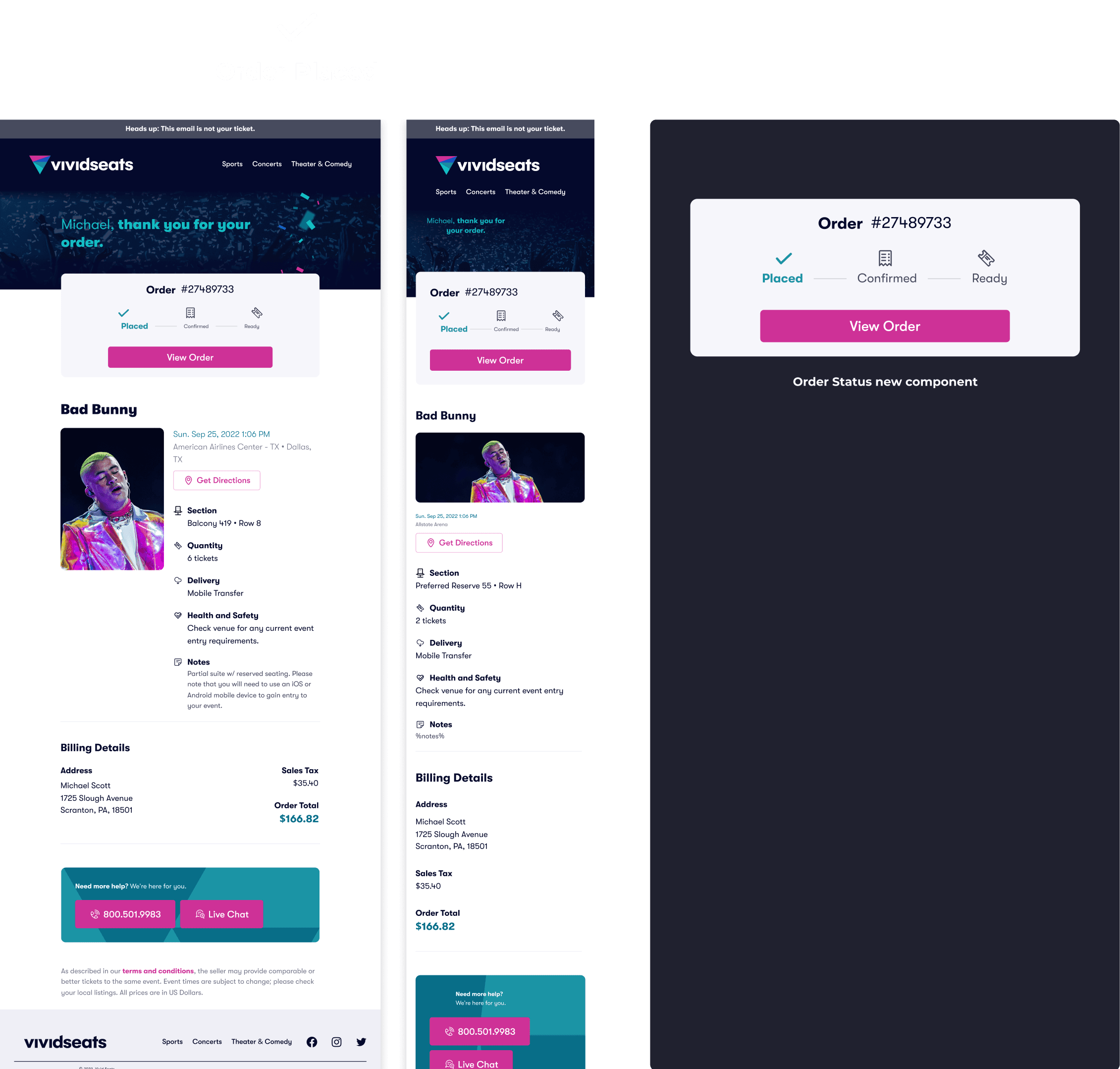
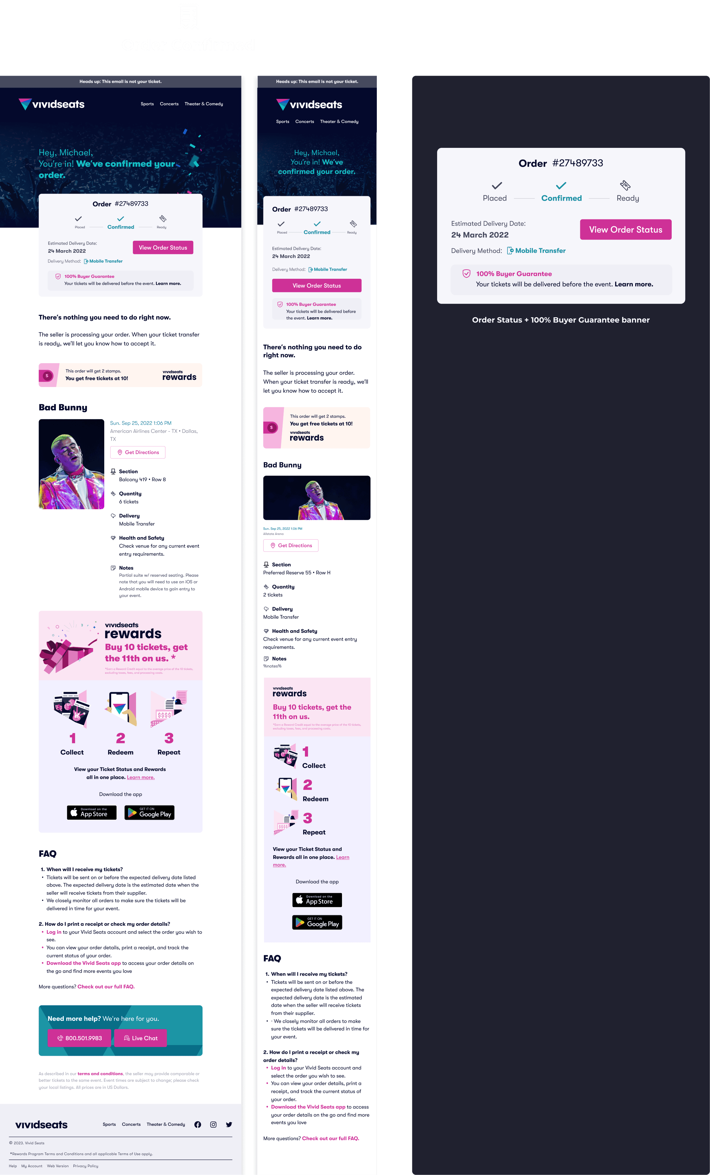
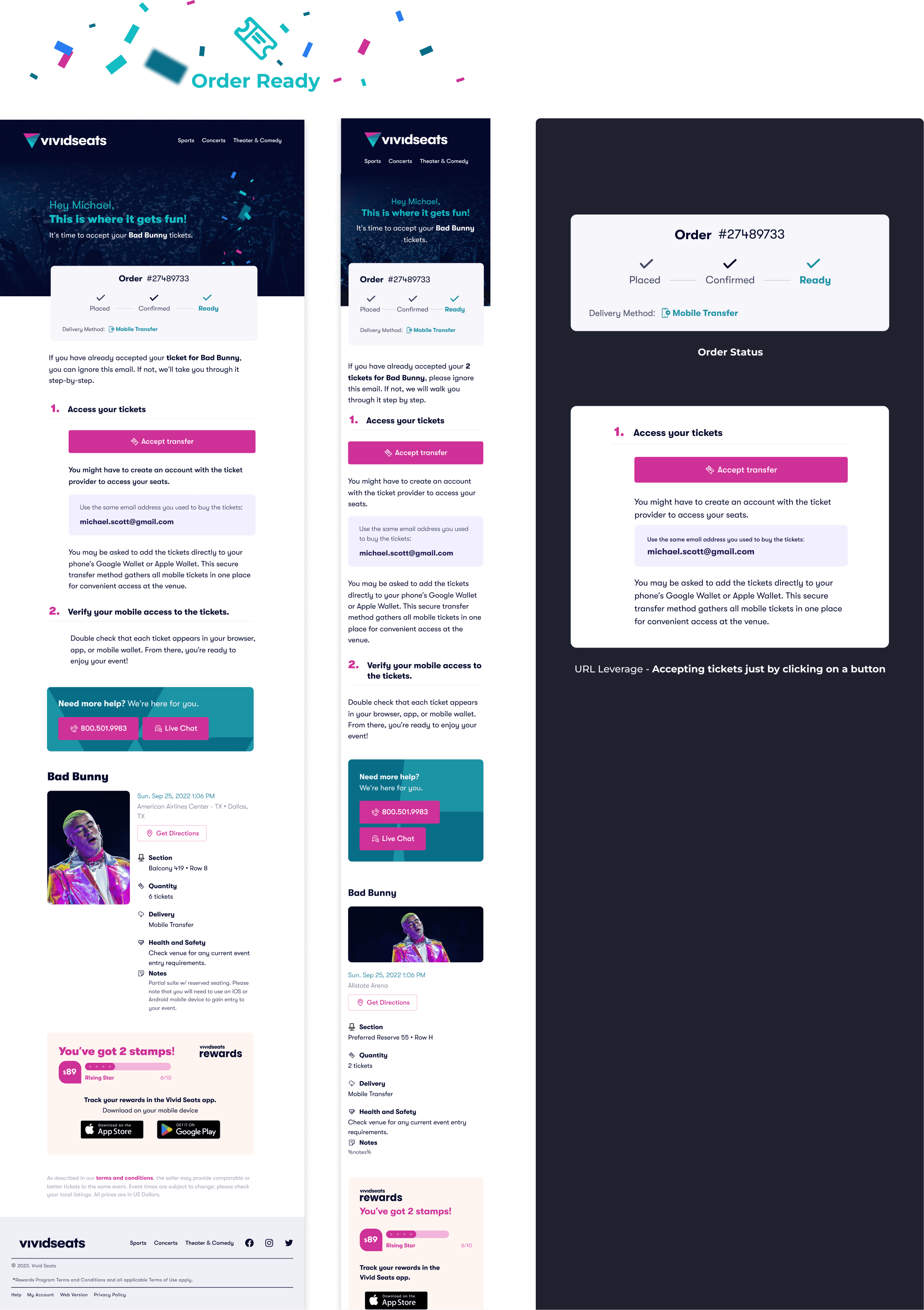
I designed 39 emails for desktop and mobile in Figma, covering all possible scenarios by combining various delivery methods and venue restrictions (e.g., MLB Ballpark app required, DICE app required).
Implementation
I used the Zurb framework (SASS version) to efficiently build email layouts in HTML based on my mockups. This sped up the verification process, and once we had a template, it became the foundation for the rest of the emails.
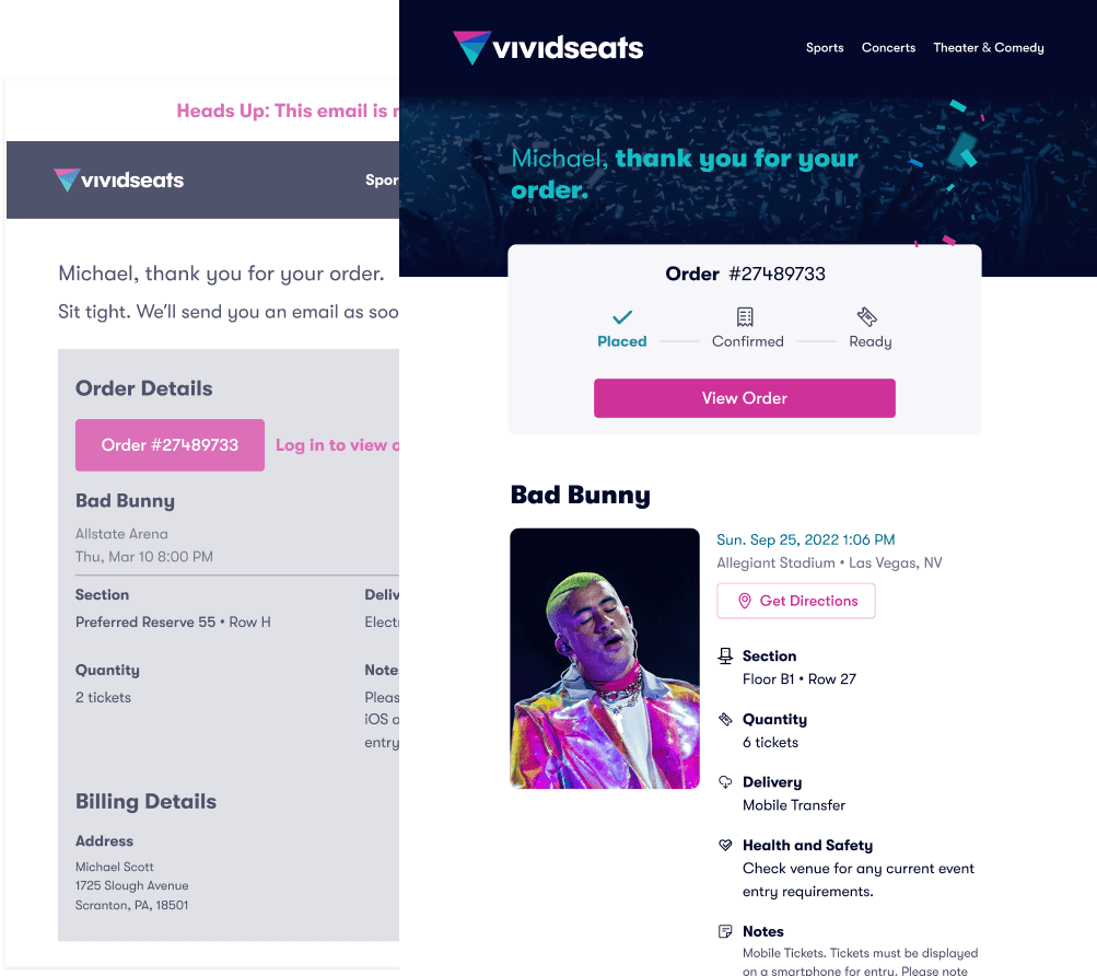
Old Design
Solution
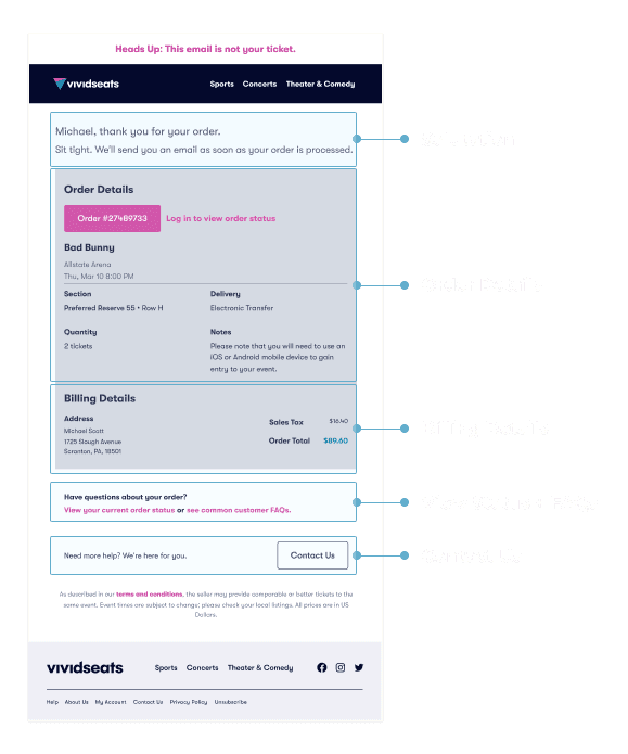
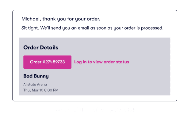
Testing results showed that the most valuable information for users was order status, expected delivery date, and delivery method. I redesigned how this information is presented by creating the Order Status Nudge, which displays order status, estimated delivery date, delivery method, and the 100% Buyer Guarantee banner to enhance trust.
Results
Clarity of message
Simplified instructions and overall communication while collaborating with UX writers from the team.
Support calls cut
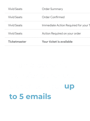
-23% decrease on WISMO (Where Is My Order?) calls
User testing results
Most participants understood the purpose of the email and found the information helpful. However, they wanted clearer details on the anticipated timeline for each step of the process. We addressed this by introducing the Order Status nudge in the app and emails.